
In contemporary branding and environmental design, signage is no longer limited to flat lettering on a wall. A texture sign uses material depth, surface finish, lighting, and tactile contrast to create a more memorable visual experience. Whether it appears in a boutique hotel lobby, a restaurant entrance, a corporate office, or a retail storefront, textured signage helps a brand feel more physical, premium, and emotionally engaging.
TLDR: Texture signs bring modern signage to life by combining materials, finishes, depth, and lighting. They make brand displays more memorable because people respond strongly to surfaces they can see and almost feel. Popular concepts include wood grain, brushed metal, stone textures, layered acrylic, concrete effects, and illuminated dimensional lettering. The best texture sign designs balance beauty, readability, durability, and brand personality.
What Is a Texture Sign?
A texture sign is any sign that uses a noticeable surface quality or dimensional finish as part of its design. Instead of relying only on color and typography, it adds an extra sensory layer through materials such as wood, metal, acrylic, stone, fabric, concrete, glass, or foam. The texture may be real, such as carved timber grain, or simulated, such as a vinyl wrap that mimics marble or brushed steel.
Modern signage design increasingly favors texture because it creates a deeper connection between a space and its audience. A smooth black acrylic logo communicates sleek professionalism. A reclaimed wood sign suggests warmth and authenticity. A brushed brass sign feels elegant and established. These material cues work instantly, often before a visitor reads a single word.
Why Texture Matters in Modern Signage
Texture works because people naturally associate surfaces with experiences. We understand rough, smooth, matte, glossy, warm, cold, heavy, and delicate through instinct and memory. In signage, these associations become powerful branding tools.
- Texture adds depth: Dimensional surfaces create shadows, highlights, and visual movement.
- Texture improves memorability: A tactile or layered sign is easier to remember than a flat printed panel.
- Texture expresses brand character: Materials communicate values such as luxury, sustainability, innovation, or craftsmanship.
- Texture supports interior design: A sign can blend with architectural finishes or become a strong focal point.
- Texture increases perceived quality: Premium materials often make a business feel more trustworthy and established.
For example, a wellness studio may use a soft matte wall sign with natural wood and subtle backlighting to create calmness. A technology company may choose layered acrylic and dark metal to suggest precision and innovation. A bakery might prefer hand painted texture or carved wood to convey warmth and craft.
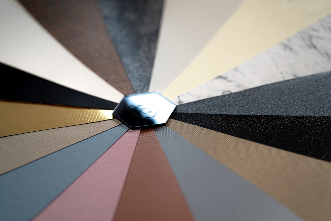
Popular Materials for Texture Sign Design
The material is often the foundation of a texture sign concept. Each option produces a different look, feel, and practical result. Choosing the right one requires thinking about brand identity, location, lighting, budget, and maintenance.
1. Wood and Wood Grain
Wood texture is one of the most versatile choices for modern signage. It can feel rustic, refined, organic, or luxurious depending on the finish. Light oak and maple offer a clean Scandinavian look, while walnut and mahogany feel richer and more traditional. Reclaimed wood adds character through knots, imperfections, and natural variation.
Wood works especially well for restaurants, cafes, boutiques, wellness spaces, eco focused brands, and hospitality environments. It can be carved, laser cut, stained, painted, or combined with metal letters for a strong contrast.
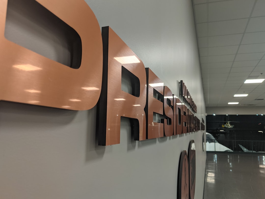
2. Brushed and Polished Metal
Metal signs are associated with strength, precision, and permanence. Brushed aluminum, stainless steel, bronze, copper, and brass are common choices. A brushed finish softens reflections and creates a directional grain, while polished metal feels bold, sleek, and high end.
Metal texture is ideal for corporate offices, law firms, financial institutions, architecture studios, luxury retail spaces, and exterior building signs. It pairs beautifully with stone, glass, concrete, and dark painted walls.
3. Stone, Marble, and Concrete Effects
Stone textures create a sense of permanence and sophistication. Real stone can be heavy and expensive, but modern fabrication techniques allow designers to use lightweight panels, printed surfaces, or composite materials that imitate stone convincingly.
Marble suggests luxury and elegance, while concrete communicates urban minimalism and industrial style. These surfaces are particularly effective when paired with refined typography and warm lighting.
4. Acrylic and Layered Plastic
Acrylic remains a favorite in modern signage because it is flexible, clean, and available in many colors and finishes. It can be glossy, frosted, translucent, mirrored, or matte. Layering acrylic pieces creates depth and shadow while keeping the sign lightweight and contemporary.
Translucent acrylic is especially useful for illuminated signs. When paired with LED lighting, it can produce glowing edges, halo effects, or soft internal illumination.
5. Fabric, Felt, and Soft Surfaces
Soft textured signage is becoming more popular in interiors where acoustic comfort and warmth matter. Felt panels, textile covered letters, and fabric backed signs can soften a space visually and functionally. These signs are commonly used in creative offices, coworking spaces, educational environments, and hospitality lounges.
Modern Texture Sign Concepts
Texture can be applied in many ways. The most successful designs use it intentionally rather than simply adding decoration. Below are several modern concepts that show how texture can transform signage.
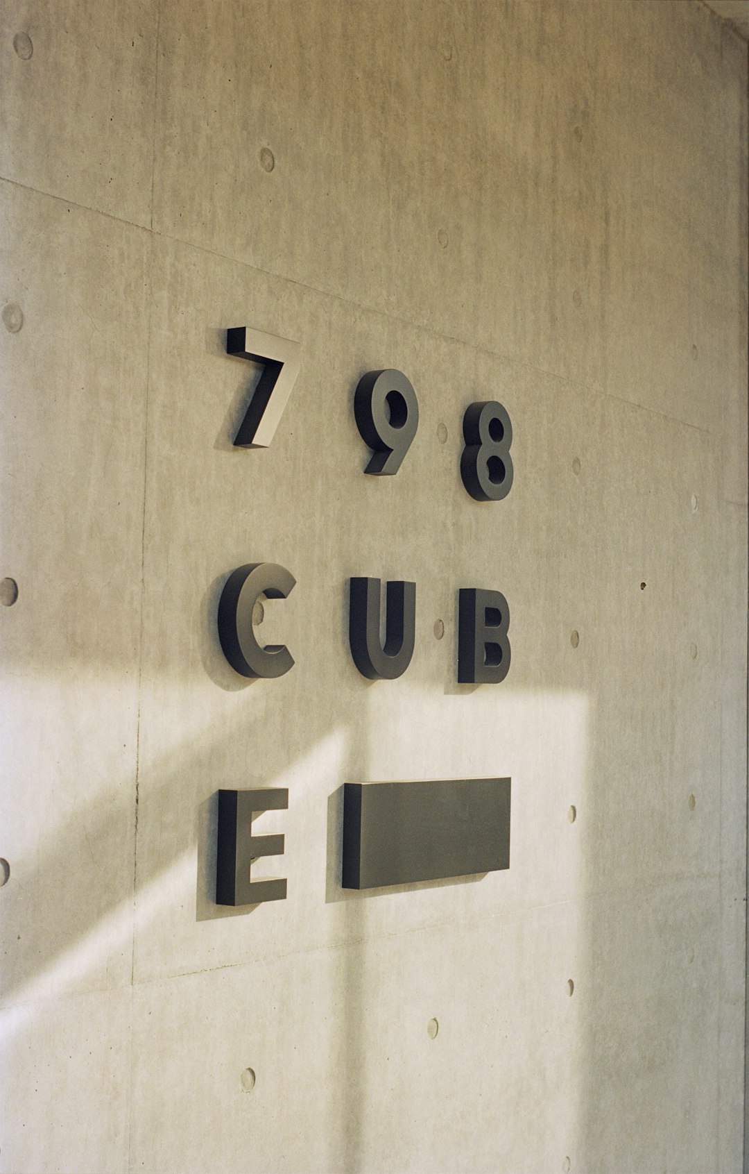
Dimensional Lettering on a Textured Background
One of the most effective concepts is to mount clean dimensional letters onto a textured wall or panel. The background may be brick, wood slats, stone veneer, fluted panels, or concrete. This approach lets the texture support the brand without overwhelming the message.
For readability, the letters should contrast clearly with the background. Dark letters on light wood, white letters on dark stone, or brass letters on matte black panels are common combinations. The goal is to create harmony between the materials while keeping the text easy to read.
Layered Signs with Shadow Depth
Layering is a major trend in signage design. A sign may include a base panel, raised logo mark, separate lettering, and backlighting. Each layer creates its own shadow, giving the sign a sculptural quality.
This concept works well for reception signs, feature walls, and retail displays. Even a simple logo can look premium when separated into layers of acrylic, metal, or wood. The shadows change throughout the day as lighting shifts, making the sign feel dynamic.
Image not found in postmetaIlluminated Texture Signs
Lighting can dramatically enhance texture. A rough surface becomes more dramatic when lit from above or below because shadows reveal its pattern. Backlit letters create a halo that separates the sign from the wall. Edge lit acrylic produces a futuristic glow.
LED lighting is the standard choice because it is energy efficient, long lasting, and available in different color temperatures. Warm white lighting pairs well with wood, brass, and hospitality spaces. Cool white lighting suits technology brands, medical settings, and modern corporate interiors.
Minimalist Matte Finishes
Not every texture sign needs dramatic grain or heavy relief. Sometimes the most modern choice is a subtle matte surface. Matte black, matte white, frosted acrylic, and satin metal all reduce glare and create a refined appearance.
Minimalist matte signs are popular because they photograph well, feel timeless, and work across many industries. They also allow typography and spacing to become the focus. In this style, texture is quiet but important; it gives the sign a premium feel without visual clutter.
Natural and Sustainable Signage
Sustainability is influencing signage design in meaningful ways. Many businesses want signs that reflect environmental responsibility. Natural textures help communicate that message clearly.
- Reclaimed wood suggests reuse and authenticity.
- Bamboo offers a renewable, clean looking surface.
- Cork brings warmth and sound absorbing qualities.
- Recycled acrylic provides a modern finish with reduced material impact.
- Water based stains and low VOC paints support healthier indoor environments.
However, sustainability should be more than a visual style. Designers should consider durability, local sourcing, repairability, and end of life disposal. A sign that lasts ten years is often more sustainable than one that looks eco friendly but deteriorates quickly.
Typography and Texture: Finding the Right Balance
Typography plays a crucial role in texture sign design. Some typefaces work beautifully with dimensional materials, while others lose clarity when cut, routed, or fabricated. Bold sans serif fonts are often reliable for modern signs because they maintain legibility at different sizes and distances.
Serif fonts can also work, especially for luxury, heritage, and editorial style brands, but fine details must be handled carefully. Thin strokes may break during fabrication or disappear against a textured background. Script fonts require special attention because delicate curves and connecting lines can become fragile or difficult to read.
A helpful rule is to let either the texture or the typography take the lead. If the material is highly expressive, such as heavily grained wood or veined marble, use simpler lettering. If the background is subtle, the type can be more distinctive.
Color Choices for Textured Signs
Color and texture are closely connected. The same color can feel very different depending on the surface. Black on glossy acrylic feels sleek and dramatic. Black on rough wood feels rustic and grounded. White on frosted glass feels calm and modern.
High contrast is usually important, especially for signs that need to be read quickly. At the same time, some premium environments use low contrast intentionally for a quiet, architectural effect. For example, raised white letters on a white textured wall can look elegant in a gallery or spa, although it may not be suitable for directional signage.
Popular modern combinations include:
- Matte black with brushed brass for luxury and sophistication.
- Natural wood with white acrylic for warmth and clarity.
- Concrete gray with black steel for industrial minimalism.
- Frosted acrylic with soft LED light for a clean futuristic look.
- Deep green with gold metal for boutique hospitality and premium retail.
Where Texture Signs Work Best
Texture signs can be used almost anywhere, but they are especially effective in places where first impressions matter. A reception area sign can immediately communicate professionalism. A storefront sign can attract pedestrians by standing out from flat printed graphics. A restaurant sign can set the mood before guests enter.
Common applications include:
- Lobby and reception signs that reinforce brand identity.
- Exterior storefront signs designed for visibility and durability.
- Wayfinding systems that use tactile materials to guide visitors.
- Menu boards and feature walls in restaurants and cafes.
- Retail display signage that supports product storytelling.
- Hotel, spa, and wellness signs that create atmosphere.
Practical Considerations Before Production
While texture signs can look impressive, they must also function well. A beautiful sign that is difficult to read, hard to clean, or unsuitable for the weather will create problems over time.
Before choosing a texture sign concept, consider these factors:
- Viewing distance: A sign viewed from far away needs larger letters and stronger contrast.
- Lighting conditions: Glossy surfaces may reflect too much light, while dark textures may need illumination.
- Indoor or outdoor use: Exterior signs must resist moisture, UV exposure, wind, and temperature changes.
- Maintenance: Deep grooves, rough wood, and fabric textures may collect dust or require special cleaning.
- Installation surface: Heavy materials need proper mounting hardware and structural support.
- Accessibility: Directional signs should prioritize legibility, contrast, and sometimes tactile or braille elements.
The Future of Texture in Signage
The future of texture signs will likely combine traditional craftsmanship with advanced technology. Digital fabrication, CNC routing, laser cutting, 3D printing, and programmable LED lighting are making it easier to create detailed and customized signage. At the same time, brands are rediscovering the value of natural materials and hand finished surfaces.
We can expect more hybrid designs: wood signs with embedded light, metal letters on acoustic felt, 3D printed forms with stone like finishes, and interactive surfaces that respond to movement or touch. Texture will continue to be a bridge between digital precision and human experience.
Final Thoughts
A texture sign is more than a label; it is a physical expression of a brand’s personality. By combining material, depth, light, color, and typography, designers can create signage that feels memorable and meaningful. The best modern signage concepts do not use texture randomly. They use it to tell a story, shape an atmosphere, and make a place feel distinctive.
In a world filled with screens and flat graphics, textured signage offers something refreshingly tangible. It invites people to look closer, notice details, and connect with a space on a sensory level. That is why texture is not just a design trend; it is becoming a central element of modern signage design.