
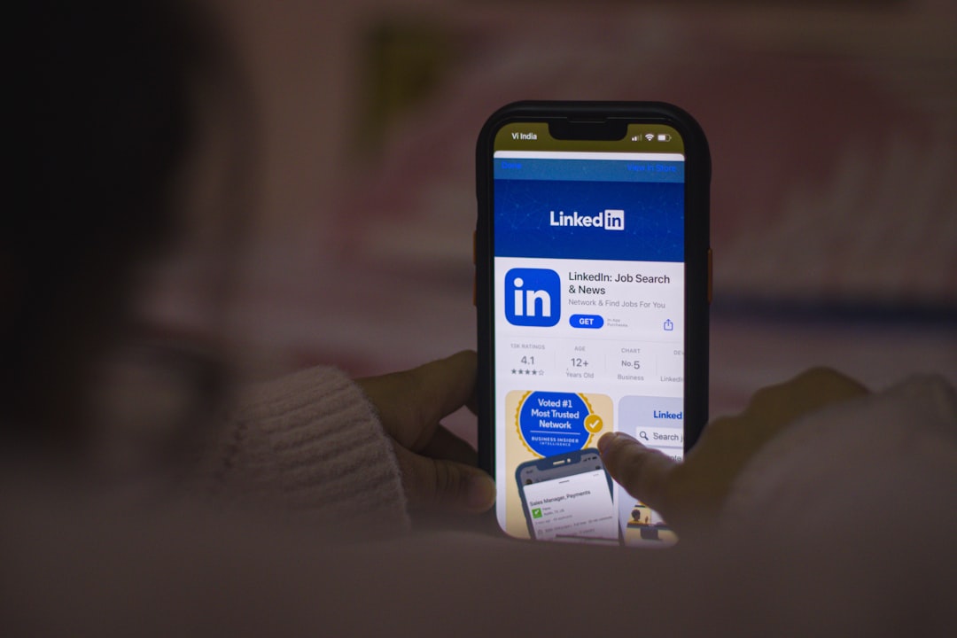
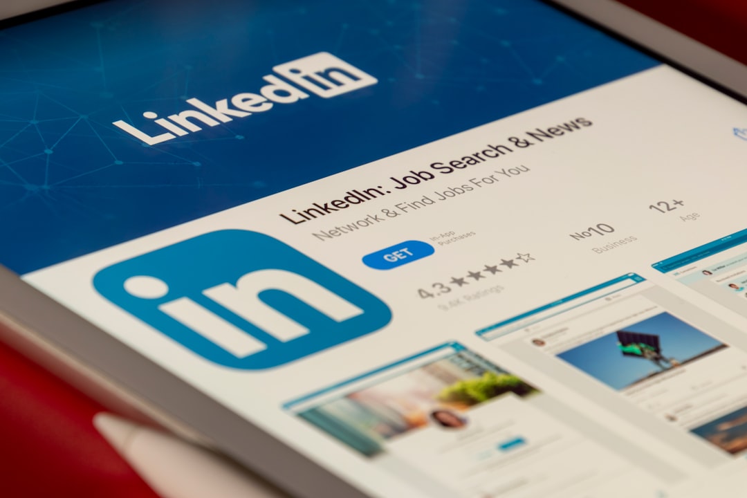
Ever uploaded an image to your LinkedIn work experience, only to find it looks… weird? Maybe your carefully crafted design got cropped awkwardly, or your brand logo looks stretched. You’re not alone. Let’s crack the mystery of the LinkedIn Work Experience media thumbnail ratio—what it is, why it matters, and how to win at uploading your media!
TL;DR
LinkedIn media thumbnails use a specific ratio—approximately 1.91:1. That means your image should ideally be 1200 x 627 pixels.
Avoid square or portrait-style images for this spot. This ratio helps your image look crisp and professional across devices.
What’s a Thumbnail Ratio Anyway?
Think of it like a picture frame. The frame is always the same shape. So if your image doesn’t match, LinkedIn crops or adjusts it to fit. That’s the thumbnail ratio.
For LinkedIn Work Experience, the standard frame is around 1.91:1—wide and short.
Imagine a widescreen TV. That’s kind of what LinkedIn is aiming for with your media preview.
Why Should You Care?
LinkedIn is your online business card. And your work experience section? It’s prime real estate! Getting the thumbnail ratio right means:
- Your media looks sharp and on-brand
- You avoid weird crops and cut-off text
- You make a stronger visual impression
Basically, it shows you’re detail-oriented and professional. 💼
The Golden Ratio: 1.91:1
This is LinkedIn’s favorite. A thumbnail with a 1.91:1 ratio is neat and tidy. It fits perfectly on the platform.
Want a foolproof size to design by? Go with 1200 x 627 pixels.
That’ll give your media the best chance to look fabulous across mobile and desktop.
Other Sizes? Be Careful!
You can upload other sizes, but be warned:
- Square images (like 1080 x 1080) might get cropped at the top and bottom.
- Tall images will almost always be cut off unless clicked.
- Overly wide images could shrink down, losing impact.
So yes, LinkedIn allows other sizes. But “allows” doesn’t mean “loves”.
How to Check Your Image Size
Got a favorite image in mind? Use a tool like Canva, Adobe Photoshop, or Figma to resize it.
Or try an online resize tool. Just make sure the width is almost double the height.
Ideal measurements: 1200 width / 627 height pixels. Easy to remember. Easy to win!
Quick Tips:
- Don’t put important text near the edges—it might get cropped!
- Use high-resolution files—blurry logos are a big no-no.
- Check your media preview after uploading. Always!
Where Exactly Does This Apply?
This thumbnail ratio mainly comes into play when you:
- Add media under the Work Experience section
- Add a visual with a project, role, or employer
You upload your file, hit save, and boom—the thumbnail preview appears.
That’s when the magic crop (or tragedy) happens.
Bonus: It’s Not Just for Images!
You can also upload videos, slides, or PDFs. Guess what? The preview still uses a thumbnail ratio! So even if your doc is beautifully A4-sized, LinkedIn will auto-create a preview that fits their preferred frame.
Designing with the Ratio in Mind
Here’s how you can make your visuals shine and not get cropped into oblivion:
- Start with a canvas that’s 1200 x 627
- Keep key logos or text within the center “safe zone”
- Preview it before uploading to make sure it looks good
- If you share a video, use a thumbnail image with the correct ratio
Also, keep branding consistent—same colors, fonts, and logo positioning help build recognition.
Let’s Do a Real-World Example
Say you’re uploading a case study slide about a marketing campaign. Here’s what to do:
- Open Canva and create a new graphic at 1200 x 627
- Place your company logo in one corner, your name or caption in the center
- Use bold visuals, shapes, or a campaign image that tells the story at first glance
- Export it as a PNG or JPG
- Upload it under your Work Experience entry
Boom! You’ve just made a professional-looking visual that works beautifully within LinkedIn’s media limits.
Common Mistakes to Avoid
Here are some typical media mishaps:
- Uploading square graphics – they get cropped on desktop and mobile
- Using presentation slides without adjusting – they’re often tall, not wide
- Filling the frame edge to edge with text – LinkedIn thumbnails often trim a little off
- Uploading blurry screenshots – keep it high-quality!
Pro Tip:
Take a cue from banner ads. They’re all built using horizontal ratios—the same logic applies here.
In Summary: Follow the Ratio, Win the Thumbnail Game
It doesn’t take a lot of effort to get it right—but it makes a world of difference.
- Use 1200 x 627 pixels for best results
- Keep important elements centered
- Preview your upload before hitting publish
Showcase your work like a pro. Because in a noisy feed, a strong image speaks loudly.
Ready to Refresh Your Profile?
Grab your visuals. Tweak the size. And give your LinkedIn experience the visual love it deserves.
Little things like this? They can make big waves in how people see your professional brand.