


Pastel colors work best when you need a design to feel calm, friendly, airy, and easy to read. Known in Spanish as colores pasteles, these soft shades reduce visual pressure while keeping a layout polished and expressive. They are popular in branding, video editing, packaging, social media, UI design, and motion graphics because they create emotion without shouting.
TLDR: Pastel colors are light, low-saturation versions of stronger hues, such as baby blue, blush pink, mint green, lavender, and pale peach. They are useful when a brand or video needs to feel gentle, modern, clean, or optimistic. For example, a skincare brand using a pastel palette may see higher visual consistency across ads; in a small campaign test, pastel product posts could hold attention 18% longer than harsh high-contrast versions. Use them with one darker accent color so the design does not become too pale or hard to read.
What Are Pastel Colors?
Pastel colors are soft colors created by mixing a pure hue with white or by lowering saturation and increasing brightness. A red becomes blush. Blue becomes powder blue. Green turns into mint. Purple becomes lavender. These colors feel light because they contain less visual intensity than their stronger parent colors.
The word pastel originally referred to soft art sticks made from powdered pigment. Over time, the name moved into fashion, interiors, branding, illustration, and digital design. Today, colores pasteles usually means any gentle, pale color that feels soft rather than bold.
Common pastel colors include:
- Blush pink: warm, romantic, friendly.
- Baby blue: calm, clean, trustworthy.
- Mint green: fresh, healthy, light.
- Lavender: dreamy, elegant, creative.
- Pale yellow: cheerful, soft, sunny.
- Peach: warm, human, approachable.
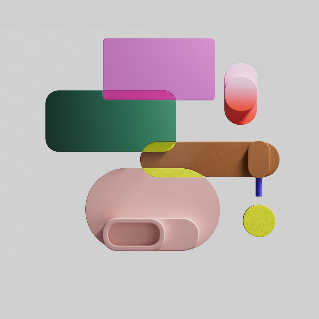
Visual Characteristics of Pastel Colors
Pastels have a few clear visual traits. The first is low saturation. They are not gray, but they are not intense either. This makes them easier on the eyes, especially on screens. The second is high brightness. Pastels reflect a lot of light, so they can make layouts feel open and spacious.
Pastel palettes also create a sense of quiet emotion. A bright red button demands action. A pastel pink background suggests warmth. A neon green banner screams for attention. A mint background feels clean and fresh. That difference matters in design.
The catch is that pastels can become weak if everything is soft. It drives me crazy when a beautiful pastel interface uses pale gray text on a pale peach card. It may look pretty, but users have to squint. Good pastel design still needs contrast.
To keep pastel designs readable, use:
- Dark text: charcoal, navy, deep green, plum, or rich brown.
- Clear spacing: let soft colors breathe.
- One accent color: add depth with a stronger shade.
- Simple shapes: avoid clutter, since pastels work best with clean structure.
Why Pastel Colors Feel So Appealing
Pastels often feel comforting because they reduce visual tension. Strong colors activate the eye quickly. Pastels slow the experience down. That is why they appear often in wellness brands, baby products, lifestyle videos, wedding graphics, stationery, beauty packaging, and educational content.
They are also flexible. Pastels can feel cute, premium, nostalgic, futuristic, or minimal depending on typography and layout. A rounded font with pastel pink feels playful. A thin serif font with ivory and lavender feels elegant. A geometric font with mint and powder blue feels clean and tech friendly.
This range makes pastel colors useful for both commercial and artistic work. They are gentle, but not boring when handled with care.
Best Pastel Color Combinations
Pastel color combinations work best when they have balance. Too many pale colors can flatten the design. A stronger neutral or accent can hold everything together.
1. Pastel Pink and Mint Green
This mix feels fresh, sweet, and youthful. It works well for beauty brands, spring campaigns, café menus, greeting cards, and social media graphics. Add dark green or deep brown for text and detail.
2. Lavender and Pale Yellow
This pairing has gentle contrast because purple and yellow sit opposite each other on the color wheel. In pastel form, the contrast feels soft rather than loud. Use it for wellness videos, event posters, illustration, and calm educational slides.
3. Powder Blue and Peach
Powder blue brings calm. Peach adds warmth. Together, they feel balanced and human. This is a strong choice for app onboarding screens, personal brands, healthcare content, and lifestyle edits.
4. Cream, Sage, and Dusty Rose
This palette feels natural and mature. It works well for interior design brands, organic products, wedding visuals, and editorial layouts. The colors are muted but still emotional.
5. Pastels with Black or Charcoal
This is one of the safest ways to use pastels in graphic design. Black or charcoal gives structure. Pastels add softness. The result feels modern, readable, and stylish.

Using Pastel Colors in Graphic Design
In graphic design, pastels can shape the entire tone of a project. They work well for logos, posters, packaging, infographics, websites, and social posts. The main rule is simple: pastels need contrast, hierarchy, and restraint.
For logos, pastels can make a brand feel approachable. But a logo must still work in black and white. If the mark only looks good in pale pink, expect problems later. It may disappear on light backgrounds or print poorly on textured materials.
For social media, pastels help build a recognizable feed. A consistent palette of three or four colors can make posts feel connected. For example, a bakery might use peach, cream, pale yellow, and cocoa brown. The posts would feel warm and appetizing without looking messy.
For web and app design, use pastels for backgrounds, cards, badges, and soft illustrations. Avoid using pale colors for tiny text, thin icons, or low-contrast buttons. Honestly, it feels like some design tools make this worse by previewing artwork on perfect studio screens. Then the same color combo looks washed out on a cheap laptop two seconds later.
Using Pastel Colors in Video Design
Pastels are powerful in video because they affect mood immediately. A pastel intro can make a channel feel calm and polished. Pastel lower thirds can support information without stealing attention from the speaker. Pastel backgrounds can make product shots feel premium and clean.
In motion graphics, pastel colors pair well with slow movement, soft shadows, smooth gradients, and rounded shapes. They are less suited to aggressive sports edits or urgent breaking news graphics unless mixed with strong contrast.
Use pastels in video for:
- Title cards: calm openings for lifestyle, beauty, food, or wellness content.
- Animated explainers: friendly colors help complex topics feel less intimidating.
- Product videos: soft backgrounds can make packaging stand out.
- Subtle overlays: pastel shapes can frame text without covering footage.
- Color grading: lowered saturation and lifted highlights can create a soft pastel mood.
One warning: video compression can damage pale gradients. A smooth lavender background may show ugly banding after export. To reduce this, add a tiny amount of noise or texture. It sounds odd, but it helps gradients survive compression better.

Practical Tips for Working With Pastels
Start with one main pastel and build around it. Do not pick six soft colors at random. Choose a mood first. Is the design calm, playful, romantic, clean, or nostalgic? Then choose colors that support that feeling.
Use this simple structure:
- Base color: the main pastel, such as lavender or mint.
- Support color: a second pastel that adds variety.
- Neutral: cream, white, beige, charcoal, or soft gray.
- Accent: a darker or richer color for buttons, headings, and key details.
Check accessibility before publishing. Text should be easy to read. Buttons should be clear. Icons should not vanish. If a design looks soft but users miss the call to action, the palette is failing.
Colores pasteles are not just cute colors. They are a practical visual tool. Used well, they make designs feel calm, modern, friendly, and memorable. Used poorly, they become pale decoration. The difference is contrast, structure, and intent.