Business Intelligence (BI) might sound fancy. But it’s really just a way to understand data. If you can tell a story with numbers, you’re doing it right. In this article, we’ll walk through a simple journey — from messy data to insights that sing. And yes, we’ll have some fun with it.
What Is BI, Anyway?
BI helps people make smart decisions based on data. Imagine data as pieces of a puzzle. BI is when you put those pieces together to show the whole picture.
Here’s what the journey looks like:
- Collect the data
- Clean it up
- Transform it
- Load it to a database
- Explore and analyze
- Create dashboards
- Tell a story
We’re going to walk through each of these steps with exercises, using fun sample data.
Step 1: Let’s Meet the Data
To learn BI, you need data to play with. A great free source of data is Kaggle or Google BigQuery public datasets. But let’s keep it simple. Here’s a basic dataset example you can copy into Excel or use in SQL:
Sample: Cupcake Sales
| Date | Location | Flavor | Units Sold | Price |
|---|---|---|---|---|
| 2024-01-01 | New York | Vanilla | 120 | 2.50 |
| 2024-01-01 | Boston | Chocolate | 80 | 2.75 |
| 2024-01-02 | New York | Red Velvet | 150 | 3.00 |
This simple table already gives us opportunities for BI fun. Let’s move to the next step.
Step 2: ETL – The Magic Behind the Scenes
ETL stands for Extract, Transform, Load.
- Extract = get the data (from your Excel, SQL, or CSV file)
- Transform = clean or rearrange the data
- Load = put it in a data warehouse or table to use
Here’s a mini exercise you can try in Excel:
- Copy-paste the cupcake data into a sheet
- Use formulas to calculate Revenue (Units Sold × Price)
- Use filters to show only data for “New York”
Transformation can also include things like:
- Combining dates
- Splitting fields (e.g., first and last names)
- Removing duplicates
If you’re using SQL, you might write a query like:
SELECT Location, Flavor, SUM(UnitsSold * Price) AS TotalRevenue
FROM CupcakeSales
GROUP BY Location, Flavor;
Nice! Now the data is prepped. On to the fun part.
Step 3: Exploring the Data
Exploring data is like detective work. You ask questions. The data gives answers.
Questions to ask:
- Which city sells the most cupcakes?
- Which flavor is the most popular?
- What’s the average price per location?
Use a tool like Excel Pivot Tables, Power BI, or Tableau to visualize.

Even a simple bar chart can help. Try making a chart of revenue by flavor. Visually, you can spot trends faster than by reading the numbers.
Step 4: Dashboards That Dazzle
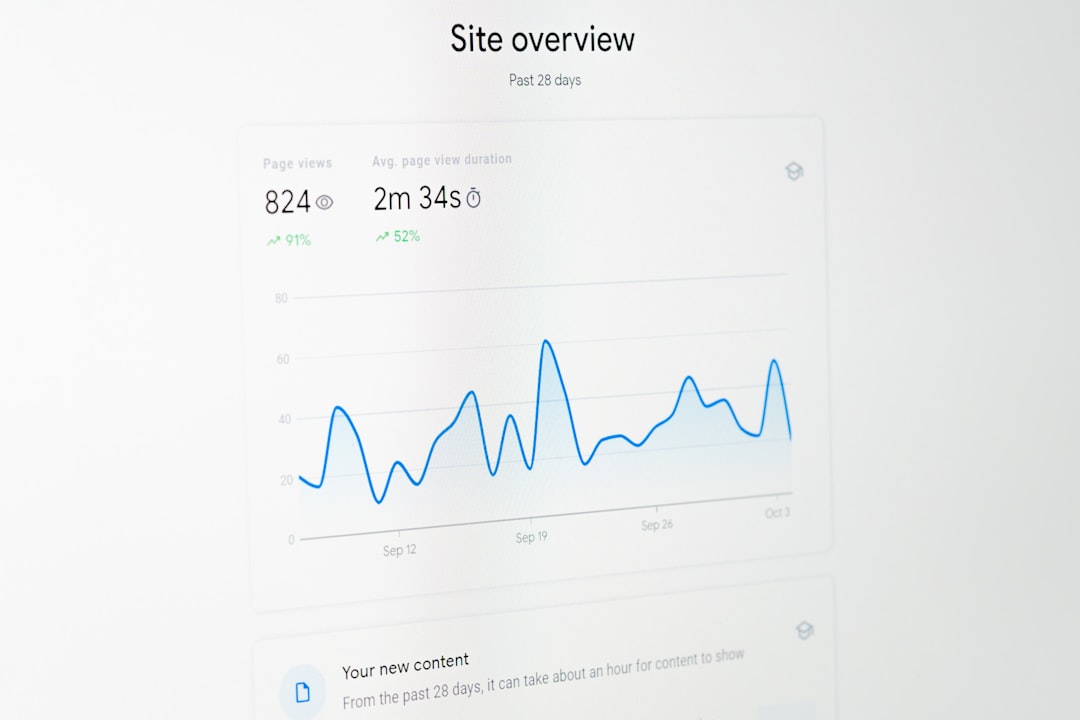
Dashboards are visual summaries of data. Think of them like car dashboards. They show you speed, fuel, and warnings all in one place.
In tools like Power BI, you can make:
- Bar and line charts
- Pie charts for sales by flavor
- Cards for key metrics like total revenue
Here’s a fun challenge:
Create a dashboard that shows:
- Total revenue
- Top 3 cupcake flavors
- Location with highest sales
Your dashboard should answer this question: How are our cupcakes doing?

Share your dashboard with a friend or on LinkedIn. Show off your BI skills!
Step 5: Tell the Story
This is where BI becomes art. Anyone can show data. Few can tell a story with it.
A good BI story has:
- A hero – maybe it’s the Red Velvet cupcake
- A challenge – maybe sales dipped in Boston after a snowstorm
- A discovery – bundling two flavors increased revenue
Use titles and captions on your visuals. Guide your audience. Don’t just drop charts on a page. Say something like:
“Red Velvet crushed it in New York this month, driving 45% of total store revenue. Boston needs a flavor shakeup – Chocolate’s declining popularity hurt weekly numbers.”
That story makes an impact. Much more than just numbers.
Bonus FUN Exercises
Test your BI brain with these challenges:
- Seasonal Sales: Add monthly data and ask: “Which months have the highest average sales?”
- Customer Ratings: Add a column with ratings (1-5 stars). Which flavors have the best reviews?
- Compare Dates: Create a line chart comparing sales from January and February.
Imagine you’re the Cupcake CEO. Use BI dashboards to make your next big decision. Should you promote Vanilla or launch a new Mocha flavor?
Tools You Can Use
Here are some beginner-friendly tools:
- Microsoft Excel – great for small data and pivot tables
- Power BI – fantastic for visuals, free to start
- Tableau Public – drag-and-drop dashboard builder
- Google Data Studio – free cloud dashboard tool
Pick one, start simple, and build confidence.
Final Thoughts
BI isn’t about being a data nerd (though that helps). It’s about curiosity. It’s about asking questions and letting the data answer.

With just one small dataset, you’ve gone from raw numbers to insights. You’ve done ETL, analysis, dashboards, and storytelling.
Now imagine what you can do with real-world company data!
Go ahead. Tell your cupcake story. The world is hungry for your insights.


