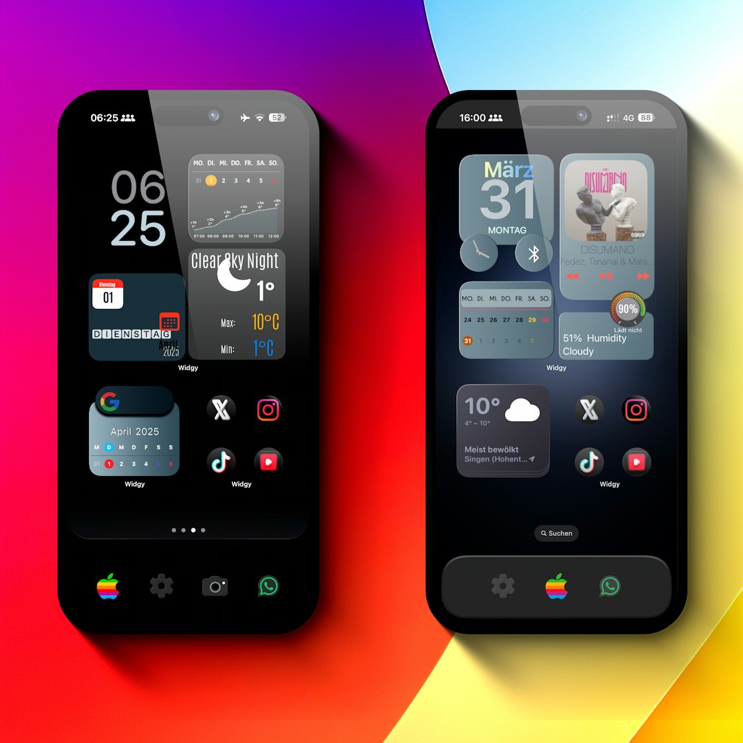
In today’s digital-first world, logos must seamlessly adapt across a variety of screen sizes and devices. From smartphones and smartwatches to desktop monitors and television screens, a scalable logo design ensures brand consistency and clarity no matter where it appears. Businesses that neglect adaptable logo layouts risk compromising their brand integrity, leading to a poor user experience and diluted branding efforts.
TLDR
A scalable logo is essential for maintaining brand identity across multiple devices and screen sizes. This article covers 12 proven logo layout styles designed to deliver flexibility without sacrificing brand recognition. From responsive versions to stacked and symbol-only logos, you’ll gain insight into practical formats used by top-tier brands. Incorporate these strategies to improve visibility and engagement in our increasingly mobile world.
1. Responsive Logo Layout
The responsive logo is a modern design strategy that adapts in real time depending on screen space availability. It begins with a fully detailed layout for larger displays and becomes more condensed on smaller screens.
- Full logo with tagline for desktops
- Logo without tagline for tablets
- Lettermark or symbol for smartphones and wearables
This dynamic approach often requires multiple logo versions created with scalability guidelines in mind. It adds development complexity but delivers a polished, professional presence across devices.
2. Horizontal Logo Layout
The horizontal (or landscape) layout arranges all logo components in a side-by-side fashion. It’s ideal for websites, navigation bars, and banners where space width exceeds height.
Advantages:
- Fits well in website headers
- Easy alignment with other UI elements
- Commonly expected in Western reading cultures (left to right)
3. Vertical (Stacked) Logo Layout
This layout formats the symbol, wordmark, and tagline on top of each other. A stacked layout is especially useful on mobile interfaces, product packaging, or centered content blocks.
Best practices include:
- Maintaining visual balance between symbol and text
- Having sufficient whitespace around the design
- Keeping layers simple to avoid clutter

4. Symbol-Only Logo Layout
Sometimes, a well-established brand can present itself with only a recognizable icon—think Apple’s apple or Nike’s swoosh. This symbol-only layout is highly flexible and scales effortlessly.
Use cases include:
- Mobile app icons
- Favicons and thumbnails
- Watermarks and merch
To use this format effectively, the symbol must already carry strong brand recognition or be introduced carefully alongside its full brand identity first.
5. Wordmark-Only Logo Layout
Wordmarks rely solely on typography to communicate the brand. Examples include Google and Coca-Cola. Without graphic symbols, readability becomes paramount across breakpoints.
Ensure proper scaling by using:
- Vector-based typography to retain sharpness
- Custom kerning and spacing for smaller sizes
- Contrasting fonts that remain readable at a distance
6. Combination Mark Layout
This layout integrates a symbol and a wordmark, either side by side or stacked. It offers flexibility by allowing each component to be used independently in alternate environments.
Benefits:
- Improves brand recall with both visuals and text
- Adapts easily into abbreviated versions
- Useful for both web and print formats
7. Emblem-Style Logo Layout
Emblematic logos seal the name and icon inside a boundary or shape, such as a shield, circle, or crest. Car manufacturers and sports teams often use this structure to convey tradition and authority.
While visually strong, emblem logos can become intricate when scaled down. Therefore, it’s important to create simplified emblem variants for smaller use cases.

8. Lettermark or Monogram Logo Layout
These logos use initials to represent longer brand names, such as IBM or CNN. Perfect for compact environments, lettermarks maintain consistency while saving space.
Key features:
- Minimalist design for high adaptability
- Benefit highly from typographic customization
- Appeal to modern digital aesthetics
9. Icon Lock-Up Layout
An icon lock-up structure places the symbol and wordmark in a fixed dynamic arrangement, such as top-left or center-right. These are not freely movable but are built for repeated use in controlled layouts like footers, headers, or social graphics.
Though less flexible, they increase branding consistency where ad-hoc logo rearrangements are performed by different design teams.
10. Adaptive System Logos
Unlike the responsive logo that transitions fluidly, adaptive logos intentionally change their appearance—but not merely in size. They might shift color palettes, messaging, or shape versions according to the context (e.g., light/dark mode, print vs digital).
This approach is advanced and requires design systems with clearly defined rules. Brands like Airbnb and Dropbox have employed adaptive identity systems to fine-tune branding across channels.
11. Dynamic or Generative Logo Layout
A newer trend in branding, generative logos are created using pre-set rules that generate infinite variations via code, algorithms, or input types. Think of Google Doodles or MIT Media Lab’s shifting iconography.
Considerations:
- Needs robust brand governance to prevent dilution
- Often used in tech-forward, experimental branding strategies
- Not suitable for all business types
12. Contextual Logo Variants
The contextual layout involves using different logo elements based on medium-specific requirements. For example, brands might use a simplified grayscale version in print or a 3D animated version in digital campaigns.
Designers must anticipate these situations and provide a comprehensive asset package to ensure consistency across applications.
Final Thoughts
Logos that scale across devices are no longer a luxury—they are a necessity in an age of ubiquitous screens. Each of the 12 layouts discussed above serves a unique purpose and fits specific use cases. There is no single best format; rather, the key is flexibility, brand coherence, and foresight.
To implement a scalable logo strategy, consider these best practices:
- Create a versatile design system with all relevant logo formats
- Use vector formats (SVG, EPS) to ensure pixel-perfect scaling
- Test logos across real devices to refine clarity and proportion
Ultimately, a brand thrives when its visual identity is both flexible and consistent. A scalable logo layout is one of the most strategic assets a modern business can develop.


