

When it comes to visual design—whether on a webpage, in an app, or on printed media—how information is prioritized and perceived is a crucial aspect of effective communication. This process is governed by what designers call visual hierarchy. It refers to the arrangement and presentation of elements in a way that clearly signifies their order of importance. Among the many tools at a designer’s disposal, three stand out in shaping visual hierarchy: motion, color, and scale.
Understanding Visual Hierarchy
Visual hierarchy operates on the principle that the human eye is naturally drawn to certain elements in a particular sequence. Effective hierarchy guides a viewer through content in a meaningful and intuitive way, drawing attention to key messages before more secondary or supporting information.
Let’s explore how motion, color, and scale play a role in establishing and enhancing this hierarchy.
Motion: Directing Attention in Dynamic Landscapes
Motion is one of the most potent tools for catching the viewer’s eye in a digital context. Our brains are hardwired to detect movement, making animated elements naturally more engaging. In user interfaces and online content, motion provides visual cues that indicate interactivity, highlight transformations, and lead users through a consistent experience.
Types of Motion Used in Visual Hierarchy:
- Micro-interactions: These are subtle animations triggered by user actions—like a button wobble or a form field highlight—that guide and confirm user interactions.
- Scrolling effects: Parallax scrolling or fade-in animations can control the pace at which information is revealed.
- Motion transitions: When switching from one view to another, animated transitions help users understand changes in context or hierarchy.
Motion should be used wisely; too many moving parts can overwhelm users and make layouts feel chaotic. Instead, a balanced application can emphasize important content while creating a memorable and enjoyable experience.

Color: Triggering Emotion & Order Through Palette
Color is more than aesthetics—it’s a psychological tool that immediately impacts how content is perceived. It can signal urgency, calm the viewer, imply importance, or even guide the order in which elements are absorbed. When used effectively, color organizes content into digestible pieces and helps establish a clear visual hierarchy.
Key Principles of Using Color in Visual Hierarchy:
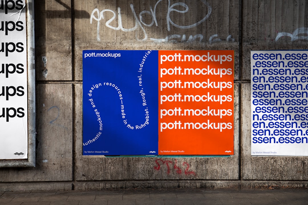
- Contrast and Emphasis: High-contrast colors catch the eye, while low-contrast elements recede into the background. Use vibrant colors for calls-to-action and important highlights.
- Color Temperature: Warm colors (reds, oranges, yellows) draw attention, while cool colors (blues, greens) offer a calming balance and can suppress less important content.
- Consistent Color Coding: By using a color code system—like red for errors and green for success—designers create predictable patterns that users quickly learn to recognize.
Strategically chosen colors not only promote readability but also ensure viewers focus on key messages first and move logically through subsequent content.
Scale: Size as a Signal of Importance
Perhaps the most straightforward of the three, scale refers to size—and in a visual hierarchy, bigger usually means more important. This principle shows up in everything from newspaper headlines to website headers. Our eyes instinctively seek out the largest elements on a page, interpreting them as the most valuable or necessary to read first.
How Scale Is Used to Influence Attention:
- Headings vs. Body Text: Larger fonts distinguish section titles and headlines, while smaller text is reserved for detailed content.
- Visual Weights: In addition to size, visual weight (how bold or dense a component appears) contributes to perceived importance. A medium-sized bolded word might hold more emphasis than a large, thin line of text.
- Proportionate Layouts: Images or illustrations that are larger than accompanying text will often command the initial gaze, establishing visual priority.
Using scale efficiently improves both usability and aesthetic balance. It makes the composition feel orderly and helps users navigate content quickly and intuitively.
Combining the Three: The Power of Integration
While powerful on their own, motion, color, and scale reach their full potential when used in tandem. For example, an animated button (motion) with a bright red hue (color) and bold typography (scale) clearly indicates a primary call-to-action. Each element reinforces the importance of the next, guiding the viewer’s experience from introduction to interaction.
Example Use Case—Website Landing Page:
- Motion: A hero image slowly fades into view, capturing immediate attention without distraction.
- Color: The call-to-action button uses a high-contrast teal against a dark background, making it pop visually.
- Scale: The headline is large and bold, ensuring the brand message is clear before the visitor reads the subtext below.
By considering how each of these elements supports one another, designers can create interfaces and layouts that intuitively speak to audience priorities, guiding the journey without ever saying a word.
Common Mistakes and How to Avoid Them
Even with a solid understanding of motion, color, and scale, misapplication can lead to confusion or distraction. Here are a few common pitfalls:
- Overuse of Motion: When multiple elements animate simultaneously or on repeat, users can become disoriented or fatigued.
- Poor Color Contrast: Using similar tones for both background and text can compromise readability and undermine hierarchy.
- Inconsistent Scaling: Making everything large in size defeats the purpose of a hierarchy, as no one element stands out.
To avoid these missteps, use user testing and accessibility standards to ensure that your design communicates clearly to all users.
Final Thoughts: Design with Purpose
Whether you’re designing a mobile app interface, a presentation deck, or a billboard, understanding and leveraging the power of motion, color, and scale in visual hierarchy can transform your message from cluttered noise into clear communication.
Start each project by asking: What do I want my audience to notice first—and why? Then, let that answer guide your decisions in animation, color usage, and sizing. When these elements are aligned with your goals, the result is more than just good-looking design—it’s design that works.